How do the Monero and Bitcoin money supply and block reward schedules compare?
Are there any graphs that easily compare the two before and after tail emission begins?
If there are graphs, how was the data to generate them created?
Amichateur made a very informative post on Reddit with graphs making this comparison and an explanation of how FreeMat was used to calculate the data.
9.4 min Bitcoin block time (de-facto avg. time since inception) For comparability, Monero block reward shown relates to 9.4 minutes intervals. The vertical line indicates the start of Monero's tail emission end of May 2022 (rate of 0.3 XMR each 1 minute).
9.4 min Bitoin Block Time - Zoomed in Monero's block reward falls below Bitcoin's block reward for ca. 9 years from beginning of 2019 till end of 2027. For all other times, Monero's block reward is always higher than Bitcoin's block reward.
10 min Bitcoin block time (but actual Bitcoin block time is more like 9.4 min) For comparability, Monero block reward shown relates to 10 minutes intervals. The vertical line indicates the start of Monero's tail emission end of May 2022 (rate of 0.3 XMR each 1 minute).
10 min Bitoin Block Time - Zoomed in Monero's block reward falls below Bitcoin's block reward for almost one decade between mid 2019 and end of 2028. For all other times, Monero's block reward is higher than Bitcoin's block reward.
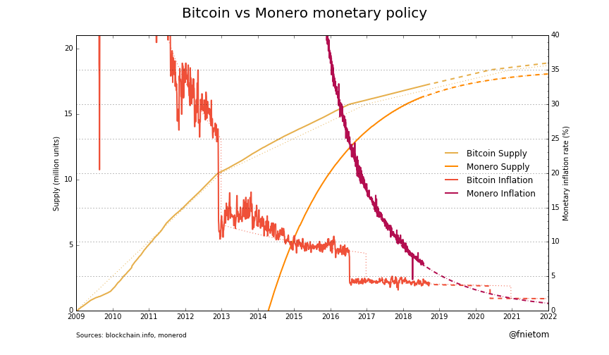
In this chart you can see a comparison of supply and monetary inflation (emission/supply) before Monero's tail emission commences at the end of May 2022. Dotted lines are target values, solid lines are actual values and dashed lines are expected future values.
 Here you can see an explanation of how Monero's emission curve is calculated. And here you can read about Bitcoin controlled supply.
After tail emission kicks in, it will produce 0.6 XMR per 2-minute block. This translates to <1% inflation decreasing over time in Monero. The number of bitcoins generated per block is set to continue decreasing geometrically, with a 50% reduction every 210,000 blocks.